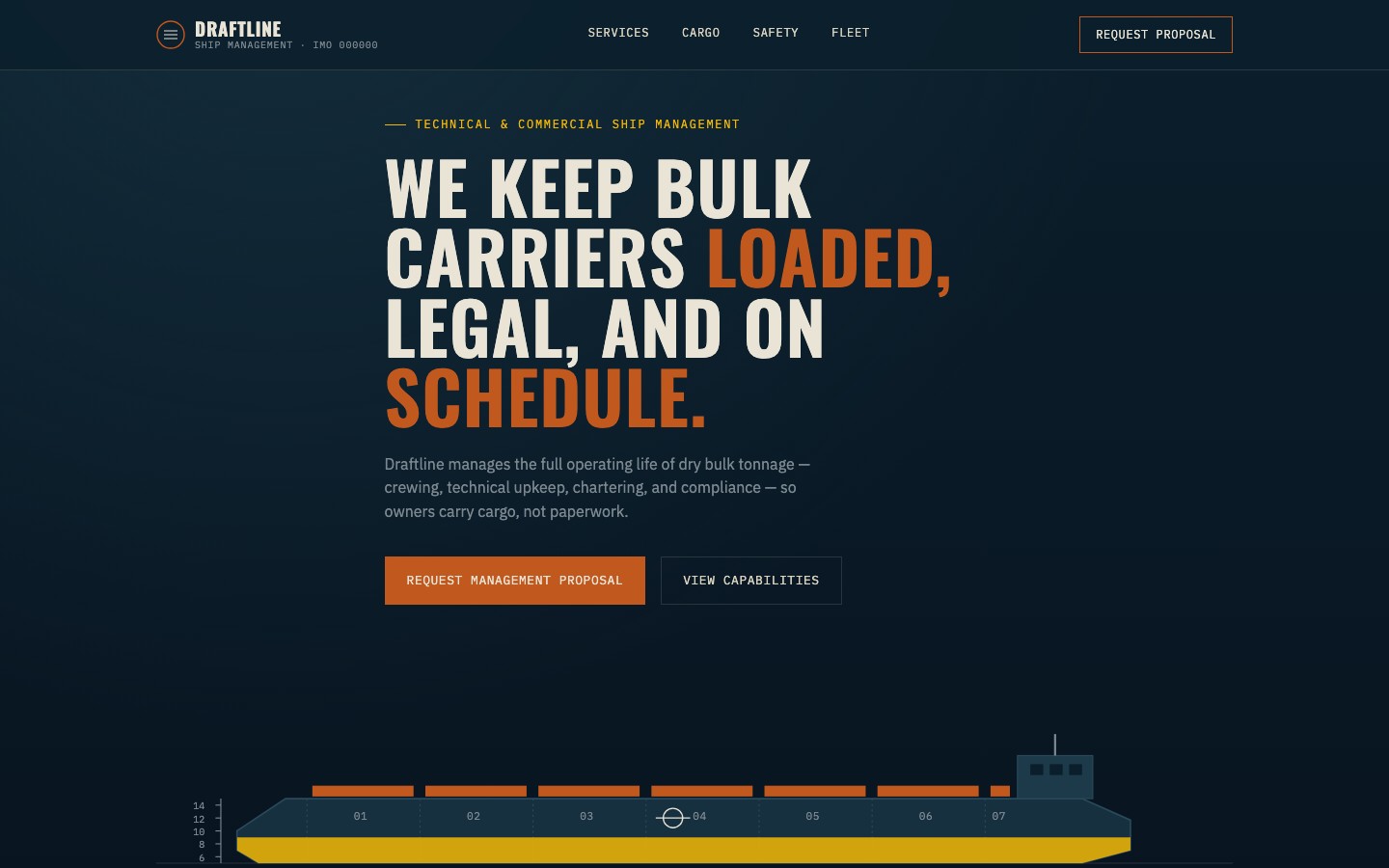
A ship management company needed a corporate website that conveyed technical competence and maritime authority. We built a B2B platform with industrial aesthetics, vessel specification displays, and a fleet management dashboard-style layout.
Draftline Ship Management is a B2B maritime services company specializing in dry bulk carrier vessel management. Their audience is vessel owners and operators — a conservative market where trust, technical credibility, and operational transparency are paramount.
The brief was clear: build a corporate website that reads like an engineering document, not a marketing brochure. Vessel owners evaluating management companies want to see fleet capability, IMO compliance data, and operational credentials — not stock photography and vague promises.
Target audience: international vessel owners, charterers, and maritime industry stakeholders who evaluate ship management companies on technical merit, safety records, and fleet specifications.
We studied the visual language of the maritime industry itself — nautical charts, port authority documents, vessel classification reports. The design needed to feel institutional, not trendy. Trust in B2B maritime comes from looking like you belong in the industry, not above it.
Deep navy (#0B1E2B) evokes ocean depth. Rust/terracotta (#C1591F) mirrors industrial weathering and ship hulls — the lived-in patina of a working fleet. Cream text (#E9E4D6) on navy reads like aged maritime documentation. The whole palette says "nautical chart meets industrial blueprint."
Every design decision was filtered through one question: would a vessel owner in a shipping office take this seriously? If it looked like a startup landing page, we rejected it.
1. Technical authority. Oswald condensed headings feel like specification sheets. IBM Plex Mono for navigation reinforces data-driven precision.
2. Industrial materiality. Rust accents, weathered tones, and structured layouts echo the physical reality of ship management — steel, documentation, inspection reports.
3. Information density. Vessel specs, IMO numbers, and fleet data displayed in dashboard-style layouts. The site respects that this audience reads data, not marketing copy.
4. Conservative trust. No playful animations or trendy interactions. Clean transitions, structured grids, and a pace that says "we've been doing this for decades."
Bright blues, wave animations, anchor icons, and every other maritime cliche. The temptation with shipping sites is to go full "ocean theme" with gradients and swooping curves. We went the opposite direction — austere, structured, industrial.
We also rejected consumer-web patterns. No testimonial carousels, no "as seen on" logos, no chatbot widgets. This is a B2B site where a single contract is worth six figures. The design needed to match that gravity.
Pulled from the maritime industrial world: deep ocean navy, hull rust, weathered cream, instrument panel grey, and signal gold for critical accents.
The page flows through an institutional narrative:
Hero (deep navy with condensed Oswald headline + rust accent) → Fleet overview (vessel specification cards with IMO numbers) → Services (technical management, crew management, commercial operations) → Vessel details (dashboard-style spec displays with DWT, LOA, beam data) → Credentials (classification society logos, flag state compliance) → Vessel acquisition form (structured B2B inquiry)
Single-file HTML architecture with GSAP for scroll-driven animations. No framework overhead — the site loads fast on the satellite connections that maritime professionals often work with. Every interaction is purposeful and restrained.
Dashboard-style vessel cards. Fleet specifications are displayed in structured card layouts mimicking bridge instrument panels — DWT, LOA, beam, draft, year built, and IMO number all visible at a glance. This serves the audience who reads vessel data the way most people read product reviews.
Condensed type system. Oswald at 600 weight for headings creates the visual density of engineering documents. IBM Plex Mono at 12px for navigation and labels adds machine-readable precision. The type hierarchy alone communicates "this is a technical operation."
Rust accent restraint. The terracotta (#C1591F) is used sparingly — section markers, hover states, and the primary CTA. Overusing it would feel decorative. Used precisely, it reads as industrial wear and maritime signage.
Form as qualification. The vessel acquisition form asks for vessel type, DWT range, and management scope upfront. This pre-qualifies inquiries and signals to prospects that Draftline speaks their language.
The finished site delivers a corporate maritime presence that vessel owners and operators take seriously. The industrial palette, condensed typography, and structured data layouts communicate technical competence before a single word of copy is read.
Visit the live site →Tell us about your project. We'll come back with a first idea within hours.