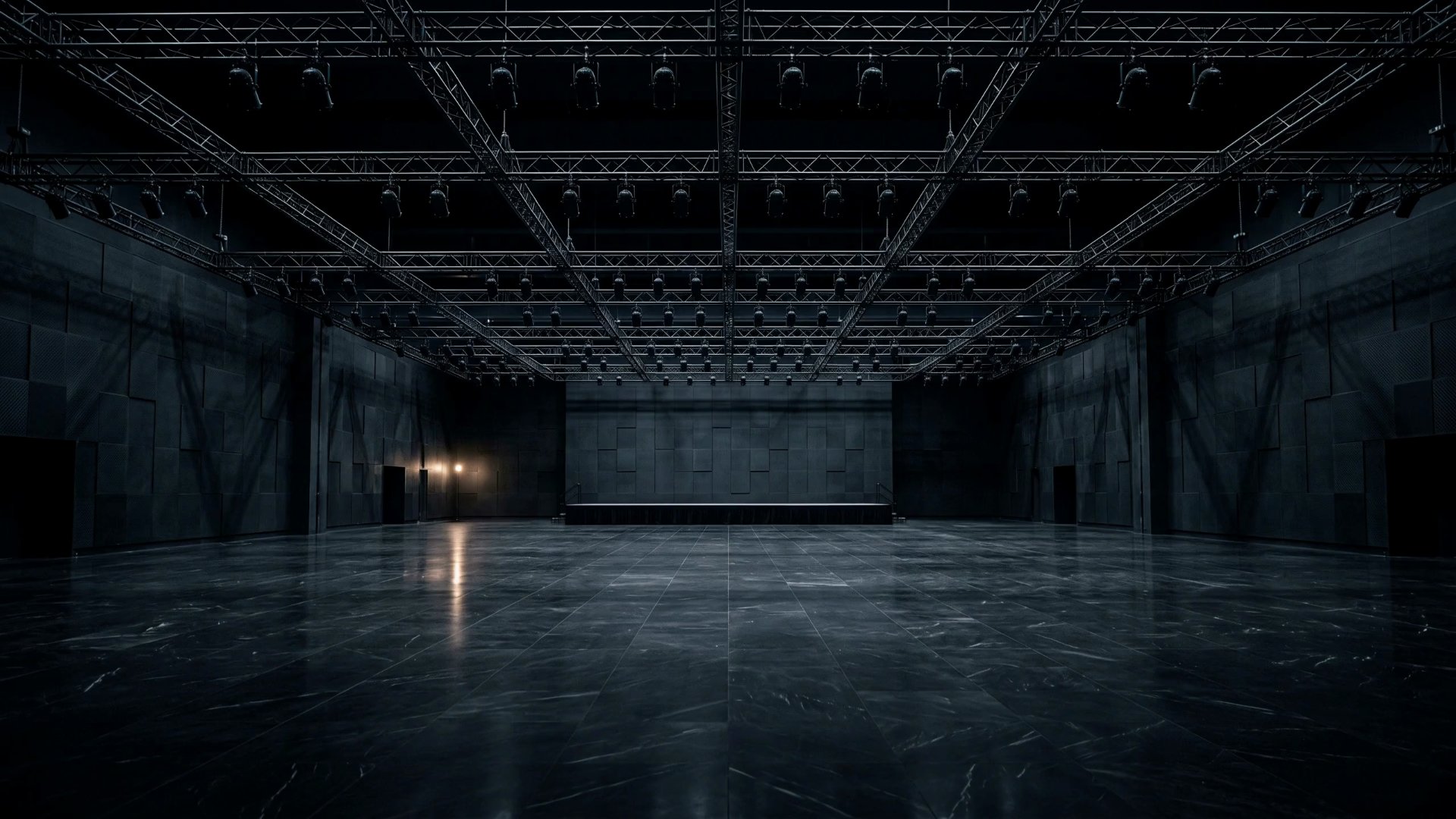
An LA event production company needed a digital presence matching the energy of their live shows. We designed a dark luxury site with AI hero video, tabbed services, and a theatrical dark-mode aesthetic.
Resonance Events is a full-service event production agency in Los Angeles handling everything from DJ and music curation to lighting, audio/AV, emcee services, decor, and photo/video coverage. Their previous site was template-based and didn't convey their premium positioning.
The brief was clear: build a site that feels like walking into a perfectly produced event. Their clients are booking five- and six-figure productions — the website needed to match that caliber. Visitors should feel the energy before they ever attend a show.
Target audience: corporate event planners, wedding couples, and private clients in the LA market who want a production partner, not just a vendor. They're comparing agencies by digital presence, and the one that feels most premium wins the inquiry.
We studied theatrical and stage design — the way lighting creates drama against darkness. The best live events use a single principle: darkness makes the light hit harder. We applied that same logic to the web design.
We chose a near-black background (#0f0f11) with warm cream (#f0ede8) typography. The contrast between these two creates a theatrical quality — like stage lighting cutting through a dark venue. No bright accent colors competing for attention. The warmth of the cream prevents the coldness you get with pure white on black.
The tab-based service interface lets visitors self-select their event type (Weddings, Corporate, or Private) instead of scrolling through irrelevant content. This respects their time and makes the site feel personalized from the first interaction.
1. Theatrical contrast. Near-black and warm cream create the feeling of stage lighting. Every element earns its brightness.
2. Self-selection UX. Tabbed service interface (Weddings / Corporate / Private) lets visitors find their event type instantly instead of scanning a generic services grid.
3. Process transparency. A 4-step timeline walks visitors through the production process from consultation to execution, reducing anxiety about booking.
4. Tiered pricing. Three pricing tiers displayed upfront so visitors can self-qualify before reaching out.
Bright neon colors, confetti animations, gallery-heavy layouts. Event sites love to go flashy with rainbow gradients and auto-playing video carousels. We went the opposite direction — controlled, elegant, confident. The kind of brand that produces, not performs.
We also rejected the typical event site pattern of endless photo galleries. Instead of showing 50 event photos, we used the AI hero video and strategic imagery to create a curated impression. Six service categories (DJ/Music, Lighting, Audio/AV, Emcee, Decor, Photo/Video) each get focused representation rather than a photo dump.
Drawn from the theatrical world: near-black for the stage, warm cream for the spotlight, white for emphasis, gray for supporting text. The warmth in the cream is deliberate — it softens the darkness and keeps the site feeling inviting rather than cold.
The page flows through a deliberate narrative sequence designed to build confidence:
AI Hero Video (full-viewport cinematic event footage) → Service Tabs (Weddings / Corporate / Private self-selection) → Six Service Categories (DJ/Music, Lighting, Audio/AV, Emcee, Decor, Photo/Video) → 4-Step Process Timeline (consultation to execution) → 3 Pricing Tiers (clear budget anchoring) → Contact / Booking
Single-file HTML architecture. No framework, no build step, no dependencies beyond GSAP for scroll-driven animations. This keeps the site fast, portable, and easy to update.
AI-generated hero video. The opening hero uses AI-generated event footage to create an immersive first impression. This eliminated the need for an expensive on-location shoot while delivering cinematic quality that sets the tone immediately.
Tabbed service interface. Rather than a long scroll through all event types, we built a tab system that lets visitors choose Weddings, Corporate, or Private. Each tab reveals relevant content, imagery, and pricing — keeping the page focused and the experience personalized.
4-step process timeline. A scroll-triggered timeline walks visitors through the production process from initial consultation through planning, production, and execution. Each step animates into view as the user scrolls, creating a sense of progression.
Dark luxury palette engineering. The near-black (#0f0f11) and warm cream (#f0ede8) pairing required careful contrast tuning. We tested every text size against WCAG standards while maintaining the theatrical aesthetic. The warm cream at this specific hex avoids the clinical feel of pure white on dark.
The finished site delivers a premium brand experience that matches the energy of Resonance's live productions. The dark luxury aesthetic with warm cream accents creates a theatrical quality that sets them apart from every template-based competitor in the LA market.
Visit the live site →Tell us about your project. We'll come back with a first idea within hours.