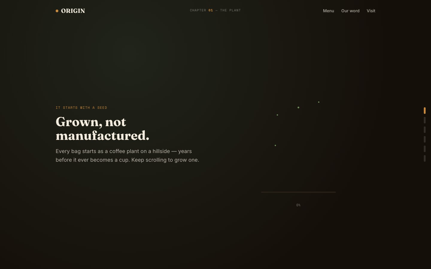
A specialty roaster wanted to tell the full seed-to-cup story. We built a chapter-based website that turns coffee production into a visual journey — from cultivation through brewing.
Origin Coffee is a specialty roaster obsessed with transparency. They source single-origin beans, manage relationships with farms directly, and control every stage from seed to cup. But their existing site looked like every other coffee brand — a hero image of latte art, a "shop now" button, and a generic "ethically sourced" tagline buried in the footer.
The brief was clear: most coffee sites stop at "we source ethically." Origin wanted to show every stage — cultivation, harvesting, processing, roasting, grinding, and brewing — as a visual journey that educates and converts.
Target audience: coffee enthusiasts who care about provenance. People who read tasting notes, ask about altitude, and choose beans the way wine drinkers choose vintages. They'll pay more if they understand why it's worth it.
We studied the coffee plant lifecycle and pulled the entire color palette from it: soil browns for the earth, leaf greens for cultivation, cherry reds for the fruit, roasted ambers for the bean. Nothing is arbitrary — every color maps to a stage in the journey.
Fraunces serif was chosen for display type because it carries warmth and craft authenticity — it feels hand-made without being precious. Inter handles body text with clean readability. Space Mono appears on pricing and labels, giving a utilitarian counterpoint to the organic warmth.
The chapter-based navigation (grow, harvest, process, roast, grind, brew) mirrors the six stages of coffee production. This turns a product page into an educational journey. Visitors don't just scroll — they follow the bean from farm to cup.
1. Story over selling. The narrative structure builds understanding before asking for a purchase. By the time visitors reach the menu, they know why the coffee costs what it does.
2. Color as content. The palette isn't decorative — it's informational. Soil browns ground the cultivation section, cherry reds mark the harvest, amber tones signal the roast. Color tells the story alongside the copy.
3. Chapter navigation. Six stages (grow, harvest, process, roast, grind, brew) give visitors a mental model of the entire production chain. Each chapter is a self-contained section with its own visual identity.
4. Card-based menu. Products are presented as cards with origin, altitude, tasting notes, and process method. No walls of text — structured data that coffee buyers actually scan for.
Minimalist white backgrounds with sans-serif type. Every third-wave coffee brand uses that look. Origin needed to feel earthier, warmer, more connected to the agricultural reality of coffee production.
We also rejected single-page scrolling with no navigation structure. The six-chapter system gives visitors a way to jump directly to what they care about — a roaster might skip to "roast," while a curious first-timer starts at "grow." Without chapters, the story would feel like an endless scroll with no landmarks.
Every color is pulled directly from the coffee plant lifecycle: soil, leaves, cherry fruit, roasted beans, and golden amber. The cream background ties it all together with a warm, natural base.
The page flows through six chapters that mirror the coffee production chain:
Hero (cream background with Fraunces headline + chapter nav) → Grow (farm origins, altitude, soil) → Harvest (cherry picking, seasonality) → Process (washed, natural, honey methods) → Roast (profiles, development curves) → Grind & Brew (preparation guides) → Menu (card-based product grid with tasting notes) → Values (direct trade, sustainability) → Contact
Single-file HTML architecture. No framework, no build step, no dependencies beyond GSAP for scroll-driven animations. The chapter navigation uses smooth scrolling with active-state indicators that update as you move through sections.
Chapter navigation system. A sticky horizontal nav bar tracks which production stage the visitor is viewing. ScrollTrigger updates the active chapter indicator as sections enter the viewport, giving continuous orientation within the six-stage journey.
Earthy color transitions. Each chapter section shifts the dominant color to match its stage — soil browns for grow, leaf greens for harvest, cherry reds for process, amber for roast. These transitions are handled through CSS custom properties updated by GSAP on scroll.
Card-based menu grid. Product cards use a structured data layout: origin country, farm altitude, process method, roast level, and tasting notes. This mirrors how specialty coffee buyers actually evaluate beans — not through marketing copy, but through specs.
Values section. A dedicated section for direct trade practices, sustainability commitments, and farmer partnerships. Positioned after the menu so visitors understand the "why" after seeing the "what."
The finished site transforms Origin's story from a generic "ethically sourced" tagline into a full visual journey. Six chapters walk visitors through every stage of coffee production, building understanding and trust before the menu ever appears. The earthy palette and Fraunces typography give it a warmth that feels authentic to the craft.
Visit the live site →Tell us about your project. We'll come back with a first idea within hours.